Reading time: Approx. 8 min
If you’re a startup agency, getting your logo designed is an exciting time. It’s the first time that you start to see the visual representation of your brand. It’s also the most important element of your brand identity as it will be used in all visual marketing.
If you already have an established brand, changing your logo can be a much more difficult task, but if dealt with delicately, even the biggest brands can and do change their logos. This kind of change would normally be preceded by a change in brand strategy, although sometimes a logo just needs refreshing.

If you’ve gone through the process of developing a brand strategy, you should already know what your company is called. If not, you’ll need to decide before design can begin. Although a studio can come up with this, it’s a time consuming process that can cost a lot of extra money. It’s also very personal and needs to be embraced by business owners. We recommend choosing your name in-house. Try avoid cliches or names that sound like other companies.
Before hiring a design studio, look at their portfolio. Most have a “style”. Be careful about asking them to produce something that falls way out of the look they’re known for.
A lot of useful context for the designer will have already come from your brand strategy (be sure to pass this on), but there are still some important decisions to make specifically around the logo. Answer the following questions to help your designer give you the best designs.
You may be wary of giving your designer too much and squashing their creativity. Trust me, the more detailed the brief, the better for all parties. Answer the questions above and give as much additional context as possible without telling the designer what to do.
PRO MOVE - Trust your design team and try take personal feelings out of the equation. You must be happy with the result and it must represent your company, but remember your brand is being designed for your users, not you.
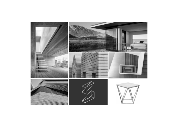
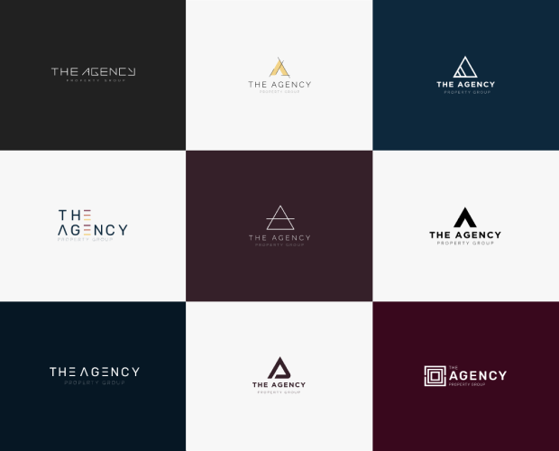
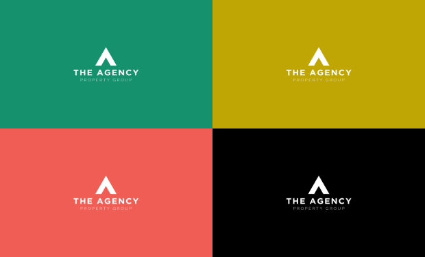
All studios work in different ways. The following is the process that Prop Data will go through and what you can probably expect from most designers:
You’re now ready to start looking at the other visual elements of your brand identity.
Personas can also be used in your sales and marketing funnel which we’ll cover later in this course. Bonus!
“What about a slogan?” I hear you say. A slogan is not your logo, although they are often seen in close vicinity. If you have a slogan, we suggest using it in your marketing where applicable, but not tied to your logo.
Copyright © 2025 Prop Data (Pty) Ltd Privacy Policy